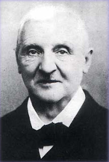
Thursday 6 December 2012

Bruckner 8-Marvellous and Magnificent


Bruckner circa 1890
Last night at the Sage, Gateshead, those  few of us who turned out were lucky to hear an excellent  performance of Bruckner's 8th Symphony in C Minor.The orchestra was the CBSO.The conductor, as stand-in at short notice for Andris Nelsons was Simone Young.This proved to be an inspired choice.To complicate the matter further and reflect the specialism of the conductor the edition used was the 1887 version rather than the more usual 1890 version.All the more credit to the orchestra for rising to the occasion.There was an introductory talk by Stephen Johnson and the event was recorded by the BBC for future transmission.The work was billed as "Bruckner's apocalyptic" which is a catchpenny title if ever there was one-and inappropriate into the bargain.

The hall was at best no more than a quarter full.Those who were present enjoyed a memorable evening.

I must admit that my heart sank a little when when Stephen Johnson announced that we would be hearing the earlier version of the symphony; but then I had never  listened to it before. It turned out to be a notably different piece with many beautiful moments not found in the later version.

To take only the first movement;in terms of dramatic interest the revised 1890 ending  seems  all the better for being quiet-from fortissimo in the original to pianissimo in 1890.The 1887 ending is a spectacular Brucknerian climax and few, maybe no composers have written more gloriously for the brass section, but enough is enough- in the right place.When Bruckner revised it he was only doing what all creative people sometimes have to do-cut good things in the interest of the work as a whole. Schalk was later to say that,

"The first movement now ends pianissimo as we all wished it would."(Howie page 611.)Who are "all" in this context one wonders?

The 1890 version seems superior in terms of  emotional drama, coherence and the implacable power and unity of the finale.But having said that, I will certainly be looking out for Ms Young's recordings of the original versions.But I do not think it fair to say that the 1887 version is "the masterpiece".

I am compelled to think nevertheless that Hermann Levi was right to express his concerns about the 1887 version and Stephen Johnson inevitably recalled the well known story of Bruckner's devastation on learning that his "artistic father" (actually 15 years younger) had doubts about the original score. Levi's tact and consideration-not to mention consternation in responding to the work reflect his understanding of the man he was dealing with.He wrote  firstly to Schalk,in a letter dated 30/09/87, before responding to Bruckner, about his own first studies of the symphony.

"I am afraid he will be totally crushed by this disapointment."
 Levi saw,
 "...great similarity with the Seventh and an almost stereotyped form. The beginning of the first movement is splendid but I don't know where to start with the development section. And the entire final movement-it is a closed book to me." (Howie,page 554.)

Levi's concerns about Bruckner's feelings were were well founded. To the composer he wrote the following in his letter of 7/10/87.

"The themes are marvellous and magnificent, but their working-out seems dubious and, in my opinion, the instrumentation is impossible." (Howie,pages 554/555)

The expected reaction did follow and it was Schalk who replied to Levi about Bruckner's reaction:

"...he is upset, in despair and no longer able to believe in himself. Meanwhile his colossal natural strength,both physical and moral, will soon help him to recover." (Howie, page 556)

Later in October 1887 Bruckner is quoted as saying that, "Levi he's a knave. It's hard for him to grasp things you know." (Korstvedt,19)

Bruckner did indeed soon recover his mental balance, and quite quickly began to revise the work. Even a great creative spirit such as he can sometime benefit from the advice of junior figures.

To say that Ms Young threw herself into the music would be an understatement and no one could say that the beat she gave was unclear. In general I thought the performance was fairly incandescent and the orchestra as a whole on very good form.The almost barbaric splendour of the finale was amply demonstrated.

At the actual Vienna premiere of the symphony on December 18, 1892, there was a greater demand for standing room tickets than for any other performance that season.(Kvorstedt,4 ) One likes to think that perhaps the young were rallying to the Bruckner cause.

PS I see that another reviewer was impressed by this performance.You can read John Leeman here,

Anton Bruckner: A Documentary Biography:Vol II, Trial and Tribulation in Vienna,by Crawford Howie.2002.
Bruckner Symphony No 8: Benjamin M Kvorstedt,2000

Sunday 18 November 2012

Not Saussure about Cyanometers

All this reading about clouds got me thinking. Somewhere in deep in the brain  the memory banks are still working, I remembered that Ruskin had an interest in measuring the blueness of the sky which is after all the background to these clouds. Eventually I tracked the reference down to Praeterita.(Last paragraph,Chapter VIII)  He gives just a sentence to say that as an adolescent he had taken a cyanometer with him to Switzerland.

Saussure cyanometer


The cyanometer was invented by Horace-Bénédict de Saussure whose work as a natural scientist was to be well known to Ruskin.The device is simply a circular gradated scale of mostly blue tints-52 in number which can be compared to an area of sky.The original instructions specified that the observer face to the north.  Alexander von Humboldt was originally keen on the cyanometer. As a scientific device it had to be consistent and he got his from de Saussure.


From an artist's point of view I can see the attraction of focussing on an area of sky and analysing its colour.But does one really need a cyanometer to do it?
It is possible that the novelty may shock one's presumptions about sky colour but why not just look for yourself, perhaps through a cut out window in a piece of card? And how do you make your own scale? What kind of blue? Do you go out and observe -in which case why not keep the observation for an actual painting? It is obvious from my research on the web that cyanometers appeal to artists-see the links below.

Sometimes I think that  a cyanometer would be just a toy. An observant person can see that the sky is likely to be whiter near the horizon on a sunny day and bluer higher up.

So, does an artist really need a cyanometer. I think not. But one could be pleasant to use and experiment with.

Why not make a cloudmeter-to study the colour of clouds? There can be infinitely subtle differences of hue between the shaded side of a cloud and the sky which is its background.The values can be very close. But my objection to the cyanometer may also be valid here.

For information on Saussure and the cyanometer read:  Why the Sky is Blue: Discovering the Color of Life by Göetz Hoeppe.There is information about Saussure and the cyanometer here. For a modern artist designed cyanometer see the work by Macarena Ruiz-Tagle.For a simple cyanometer-which would certainly make an interesting project for children see the website of artist Benoit Philippe. For a modern design of a cyanometer see this site.

Tuesday 13 November 2012

Sisley at Moret


 The Church at Moret: Evening
Musée du Petit-Palais, Paris


This postcard dates from about 1896/1899
-undivided back/République Française.Roughly contemporary with the Sisley paintings.


As you can see,both Sisley and the photographer stood in more or less the same spot to make their images.No influence is implied either way. One of the most consistently Impressionist of the Impressionists, Alfred Sisley spent the last years of his career at Moret-sur-Loing near Fontainebleau.Perhaps it was this consistency of outlook which caused Camille Pissarro to name him, when asked for an example, as a typical impressionist.The very late series of paintings of the church is one of Sisley's finest groups.They are comparable in quality to Pissarro's work at Rouen and perhaps also to those by Monet from the same city.Actually,in some ways I think I like them better than the Monet's.

In the UK there is a fine example at the Glasgow and another at Birmingham.

This is the Glasgow painting.


In the card above, you can see on the right, the wooden structure of the Provencher watermill which appears in many of Sisley's works. 

Friday 26 October 2012

THE PROBLEMS WITH PAINT

I have commented recently about paintings framed under glass. The usual reason is because of the fragility of the paint surface.  (In the case of Francis Bacon it was because of the distancing/dislocating/ ambiguities caused by reflections which he liked.)

In a recent show at the Laing there were paintings in oils under glass and there were two big acrylics likewise.That by Hockney and the similar sized work by Michael Andrews. Both were painted in the last 50 years and it must be presumed that they are under glass because they are fragile.One of the problems with acrylics has been their tendency towards softening and tackiness in a warm environment.Thus they are likely to acquire embedded dirt.Historically acrylics have been something of a problem to varnish. The problem at first was compounded by  the poor quality of the varnish and by the fact that it is hard to discriminate between varnish and the paint-both having a similar vehicle.

To be fair I must say that there have been similar problems with oils where the components of the varnish may well be similar to the components of the binder/vehicle used in the painting.This makes restoring Old Master paintings a problem which requires considerable sensitivity.It has lead to controversy in many countries. The sins of restorers have been unending.The damage done in the past was extraordinary. Interfering with and experimenting on masterpieces has historically been, not exactly the norm but extremely common well into the C20.There is something about human nature which leads many to be unable to leave well alone. It happens in all areas of human activity-I'm thinking of fads in surgery: it certainly happens in the fine arts.


I suspect that the varnishes for acrylics have improved considerably over the years. Some can now be removed with mineral spirits-different from the binder so hopefully leading to less destructive interventions.

I have painted in acrylics myself but they are a mixed blessing for a landscape painter.Even in mild weather it is difficult to keep the painting from drying out.You can add retarder,you can spray your palette with water but the paint still hardens quickly.The pleasure of painting wet in wet is effectively denied to the artist working with acrylics.


Tuesday 23 October 2012

Sculptured Mist

Constable, oil on paper,5 Sept 1822

Clouds are."... definite and very beautiful forms of sculptured mist..." Those are Ruskin's inimitable words from The Elements of Drawing.(His very interesting book is easily available in paperback or can be downloaded from Project Gutenberg.) For a long time I have been wanting to improve my own painting of clouds. They are so important in landscapes, and, as Constable said, the sky is the chief organ of sentiment in a landscape. Which means I believe, that it sets the mood of a painting. Ruskin held the well-founded believed that artists tend to fall into two groups when it comes to the painting of clouds.

"....ordinary artists have always fallen into one of two faults: either, in rounding the clouds, they make them as solid and hard-edged as a heap of stones tied up in a sack, or they represent them not as rounded at all, but as vague wreaths of mist or flat lights in the sky...."

 My own work has  tended towards the heap of stones tied up in a sack variety.I am in good company. At least I understood that clouds are three dimensional objects. I do not agree with Ruskin entirely: some clouds  appear only as wraith like forms and we cannot really assess their three dimensionality.Not all are like those I saw recently at Craster, where, looking to the south the overlapping layers of cloud streets were lit in a harsh light-tending towards monochrome effects producing chiaroscuro indeed.

The subject of clouds in art is the theme of John Constable's Skies: A Fusion of Art and Science (1999) by  John E Thornes who at the time of writing was a professor at Birmingham University.One of its many virtues lies in a meteorologist's expertise about weather,light and the sky.There is a section of historical analysis of the work of great painters who made clouds a feature of their art.This includes artists of the C17 such as Poussin, Claude,Rubens,the Dutchmen,and others such as Giovanni Bellini and Gainsborough.

Thornes has  studied the weather records for the time as made by observers such as, most notably, Luke Howard, and made estimates as to how much Constable's sketches tally with what is found in these records .He also looks at the weather records with the aim of helping to date those of Constable's sketches which don't have a complete autograph date. Constable sometimes only gave the day of the month and not the year. Thornes looks at the records and compares them with Constable's own annotations thus  attempting, fairly persuasively, to date the undated-a question basically of deciding between 1821 and 1822.

Thornes' criticisms of Constable are very interesting from the scientific point of view. He suggests that the sky in the delightfully fresh Wivenhoe Park seems to rear up behind the landscape. This may be the case but a painting has factors which meteorologists may not appreciate.There is such a thing as the picture plane.In another instance he remarks that the sky in Gainsborough's Mr and Mrs Andrews is suggestive of a smoke from a bonfire, and you can see what he is getting at. Constable and Gainsborough were doing what they could in the circumstances of their time, they were making and matching.

He is not the first to point out that the records in the Constable sketches were not transferred to his major works.So that the changing sky in Landscape : Noon which we know as The  Haywain is something which Constable constructed from memory. He wants some meteorological drama and gets it by composing a cloud scene.

I cannot recommend this book highly enough to any artist--or art historian interested in the subject of clouds in general or Constable in particular.

Monday 22 October 2012

Pochades-or not

Craster Concrete IV
This is a pochade. It fits my definition of the term  because it is a small painting.In art history you particularly come across the term pochade with reference to those little panels which Seurat painted in connection with the Bathers and the Grande Jatte. Monet uses he term pochade in his letters of the 1870s and 1880s.His idea of a pochade is always a painting larger than a Seurat panel.According to John House*, Monet's pochades can measure as much as 73X92 cms in the case of the very well known painting of La Grenouillère in the National Gallery, London.Perhaps this is what Monet would have called a large pochade-he does use the term.And he also uses the term esquisse-almost interchangeably.But it jars considerably when I see someone referring to pochades by Constable-with reference to the same-size sketches for his six-footers.But this is what you find on the very inadequate entry on Wikipedia. 

No, the word is French and must relate to poche=pocket. The work is small, so it could fit in your pocket.

There is a group on Flickr devoted to pochades and there you can see works by Tadeusz Deregowski who does tiny pochades which must be about the size of a hand.He makes an individual box for each work.You can see his website here.They are really enjoyable and very freely painted.A good pochade will be small but these do not look like small paintings.

*Monet: Nature into Art"by John House;Yale,1986. See especially chapter 6.

Saturday 13 October 2012

See For Yourself


Study of Rocks at Glenfinlas: John Ruskin

The art shelves of our public libraries are laden with  how-to-do-it books which are there to enthuse the amateur artist. In the UK, typically they deal with watercolour painting. This is the medium with which so many  beginners choose to begin their struggles. It may not be a wise choice because it is a very difficult medium to handle successfully.More tractable media such as oil or acrylic are seen as more expensive or more "advanced". It is also more awkward to transport oil paintings to and from class.I expect that these books are aimed at the evening class market and the timid neophyte.They typically have titles similar to the following: Landscape in Half an Hour, or Landcape Free and Easy-I made those up. Landscape painting is not easy and never was, nor will be:not for Cotman,Cézanne,or Constable.You might  think that  the 10.000 hour rule would be more to the point here.If anyone offers to teach you the secrets of creating art be very wary. Tricks of the trade,if they exist, will only help you to imitate someone else.If you must imitate someone, as one does a little when starting out, then pick someone who produced good work. (it is unlikely that they will have written a how-to-do-it manual.)

I have looked at a few how-to-do-it books recently and my rough conclusion is that you will get somewhat better quality from an American author than an English one. Also, you are likely to find that if this author is established he probably (They are frequently he) trained as an illustrator and cannot escape his training.That is not a recommendation.

The technical side of painting is not excessively complicated.There is much information-and disinformation, available on the web if you need to know how to prepare for painting.You might want something which explained colour mixing and I would hope that any text would say something about at least one kind of colour system such as Munsell. It is very difficult describing and talking about colour but artists at any level should have some ability to make reasoned descriptions of the colours and the contrasts  they see.

The work illustrated in these texts is usually mediocre in the extreme.I don't think that I have seen one which I really liked.If you want to copy someone else's schemata look at the acknowledged masters and start from there.Copying has its place. The process of observation and recording is complex.We have our own idea even if we cannot execute it.This can be modified by study of other artists and of course by our own observation.If you must copy, then choose an artist of quality.But you will make no progress without putting in time to observe and literally, see for yourself.

So, are there any books which I would recommend? You could do worse than start at the very beginning with Ruskin's The Elements of Drawing.Ruskin had a lot more imagination than most who teach beginners in watercolour.His exercises are written in a friendly and thoughtfully practical manner which show that he had given time to thinking about the way to begin and been able to visualise someone starting out.He tells you how to set up a simple scene to draw and begin from there.But be warned,it isn't something you can pickup overnight.Nevertheless,as he says,it is easier to learn than piano playing. You can get a free copy of this book from Project Gutenberg  or an exceedingly cheap text for Kindle. If buying the book I would recommend the Dover reprint with introduction by Lawrence Campbell.

Monday 1 October 2012

Symbolist Landscape


To Edinburgh with an old friend to see the exhibition of Symbolist Landscape painting at the National Gallery which ends 13 Oct 2012.  Edinburgh is where you go to see small, high quality and thoughtful exhibitions. I would go a long way to see a Hodler landscape - and there are two in this show: two Hammershøis and various other intensly interesting Scandinavian works. There were also an Angrand and a major Signac.There is a good Signac in Glasgow by the way. This show is built around some choice loans  The most obvious is the Vision after the Sermon, the daddy of all symbolist landscapes.It will be shown at all three venues, which include Amsterdam and Helsinki. Edinburgh has two other Gauguins - one of them in this show.

 So what is symbolist landscape painting? It is painting which seems to convey a meaning other than pure description - if there ever was such a thing.It may be concerned with mood - the state of the soul for example. It follows that to a post-romantic sensibility almost any landscape painting may qualify.The Gauguin blends both in a highly decorative way (he would not have refused the term). Human beings often do not figure largely in these works but their presence may be hinted at; for example by a light behind a curtain (Le Sidaner) In this exhibition Ring's painting


Lundbye's Bench at Lake Arresø shows a wooden seat under a tree - a seat frequented by a major landscapist. Van Gogh would have understood the symbolism - the empty chair-shades of Dickens/Fildes etc. But the subject is portrayed in an extremely naturalistic way and the symbolism is underplayed.That the idea of symbolist landscape can accomodate (if it can) Ring and Maurice Denis just shows how fluid a concept it is.  It is one of the finest depictions of winter light that I know - the harsh clear light, possibly of March. It is a small jewel and in exquisite condition. Needless to say the Ordrupgaard website claims Ring, entirely reasonably, as a master of realism....which only goes to show that classification of paintings is in the mind of the beholder. Quite few of these works will be familiar from standard works on Scandinavian art. Prince Eugen's painting must be well travelled. So too the Jansson. You have to wonder how much the existence of an illustration predicts the choice of a work for exhibition - and/or the existence of appropriate custom made cases for transport.

Matisse's lumbering Luxe, Calme et Volupté is illustrated in the catalogue (not the slightest chance of it going on tour). As a subject it is no more radical than a work by Puvis, by whom there was one work present. I still find it strange that Puvis was so important to progressive artists of the 80s and 90s but that is the case.

 There were many interesting groupings - a Whistler next to the Angrand next to the Signac in one room.This is because of the then contemporary fad of giving or grouping works with musical titles or associations. In another a Munch next to the Jansson next to a Hodler.And speaking of Jansson, when will we have an exhibition here? Paris  had one in 1999 and the Musée d'Orsay acquired their Jansson in 2000.

The miserable grey green in the main hall - sorry, the Royal Bank of Scotland Room-may have harmonised with the paintings such as Prince Eugen's treescape but only deadened it.

The serene and fastidious  solemnity of Hammershøi's painting of the  Amalienborg certainly had a dreamy quality.

One treasure was the group of small temperas by Čiurlionis. These were abstracted designs based on memories of travel - including various lights seen and the sparks which steam trains emit from their fireboxes. I liked them very much for their spontaneity. I'm not sure if I would like his bigger, more elaborate works so much.Those seem to anticipate aspects of futurism and art deco in some ways but are themselves sui generis.What a pity they are not shown in the catalogue.You can see them here -though the colour seems a little exaggerated.

Regarding Hodler we must congratulate Edinburgh on being able to produce an example for this  exhibition. I don't think there are any Hodlers in Helsinki or Amsterdam.The acquisition of this one for Edinburgh must be due to the imagination of Douglas Hall, the founder keeper of the SNGMA. Just to check things out I looked at the Tate website and of course they do not have a Hodler. Indeed the SNGMA website makes the reasonable claim that it is almost certainly the only Hodler in the UK. Nor does Tate have a Signac either.The Signac landscape at the National Gallery is a loan. A black mark for Rothenstein/Reid/Bowness era. So too for Serota who has been around a long time though working within Thatcherite budgets. Nowadays a Hodler  would be placed with the National Gallery in London. Very few major galleries can get one but there are three Hodlers in the Musée d'Orsay and the Tate never really got started.No Angrand in the National Gallery or Tate.

Monday 10 September 2012

Sarah Losh

Tombstone for Sarah and Katharine Losh

I was pleased to learn that Jenny Uglow has just published a book on Sarah Losh.It prompted me to look up such of my photos of Wreay which have not got lost in the digital otherworld.  It is a surprise that no serious popular study has appeared before now for the whole story, particularly of the remarkable church Ms Losh designed, was a tale waiting to happen. In some aspects it is a theme you might have found in an A S Byatt novel.This, though, is true.


I have sometimes wondered if the interior at Wreay is not a kind of assemblage of oddities.Bits of this and that were brought to the ensemble from many diverse locations.This doesn't look quite like a unified conception both decoratively and formally:on this I should like to be proved wrong.

The pinecone

Here was a wealthy spinster who designed a most unusual church which she filled with symbolism based on natural forms.In some ways I like her gravestone most of all.The roughness is most un-Victorian: so too the biomorphic form suggestive of marine life.It is a pity about the miserable contemporary lettering-the equivalent of the wretched Courier of our own time.
In these circumstances one almost expects a specially designed lettering unique to the situation.It is a tombstone which must surely have been planned before death.The very standard contemporary lettering is unfortunate. It rather lets down the conception.You almost expect a special script just for this place alone.

The inscription: In vita divisa in morte conjunctae (though separated in life they were united in death)refers to this being the common grave of the sisters Sarah and Katharine Losh.

 And speaking of graves, there is a James Losh buried at Gosforth. His dates of 1763-1833 could just possibly make him a brother of Sarah.No doubt Ms Uglow will explain.James was a barrister and his statue by Lough is in the Lit&Phil.There were three other males from the Losh family active in Newcastle industry at the end of the C18 .

I am looking forward to reading this book and based on what I know of her earlier work on Hogarth and Bewick it will be a good and authoritative read.

Tuesday 21 August 2012

Gingall or Jingall


 This is a Chinese gingall as displayed in the small Northumbrian town of Bellingham.It was removed from the north-western of the Dagu forts during one of the British/foreign  interventions in China (June 17,1900).This was the Battle of the Dagu forts near Tianjin. According to wikipedia this can be classed as an unprovoked act of war. The gingall was presented to the town by Edward Charlton-there's a good reiver name. (He later became an admiral and a Sir Edward). 

Saturday 4 August 2012

How we got to Rousham

Rousham Eyecatcher

It was quite  by accident that we came on the eyecatcher at Rousham. We were totally lost and though it was obvious that we were in the vicinity I couldn't work out the correct route. In the silent high-walled village of Steeple Ashton we turned down what became a farm track and there it was. From its location I could work out the direction for Rousham and we soon got there. Eventually Shire publications asked if they could use my photo and sent me in return a copy  of their new book on Georgian Garden Buildings. Unfortunately they cropped out most of the image.The original is above.It is an interesting book nevertheless.


Thursday 21 June 2012

PORTRAITS

Auntie by Aleah Chapin

I came across an item about the BP Portrait Award 2012 Exhibition on the BBC Website. Of course they stress the fact that the prizewinning work represents a three-quarter length female nude.Only a detail of head and shoulders was shown and before viewing the whole image -and the works of others on the shortlist.There was a warning that nudity was involved.I don't know who the BBC was trying to please by this unnecessary warning. It seems particularly pointless but who knows what goes through the minds of these folk.

Ms Chapin's painting is in one way representative of what you might almost call the BP aesthetic.There is often a strong dependency on photography in the works of the exhibitors;either literally or in spirit. There is usually a bright clear lighting. It is so common in works in these shows as to be typical.It is deadening ,lifeless and boring.It seems to me that Ms Chapin uses photography as much as the next portraitist. Look at her website and there are paintings where the pose, or groupings when there is more than one figure, would be hard to record without photography. Users of photography will say that they are perfectly entitled to use any source they like in their work-and so they are.But it does seem rather trivial to me.

Thursday 31 May 2012

Family Matters

It is summer and the Laing Art gallery is host to yet another thematic compilation on the theme of The Family.The works in it are a very mixed back and include Stanley Spencer in fairly gross. So too Ms Rego.Shows like this are empty and pretentious. You could argue that a kind of musée imaginaire is being provided which is bound to strike some sparks-and that is true but it still seems an excuse to shoehorn whatever is available into a travelling exhibition.Produce a work of art and anyone with a degree of imagination will be able to relate it to a general theme.They are neither social histories nor a scholarly and therefore potentially enriching monographic show.This one is a ragbag of odds and ends and the captioning can be quite fatuous .

The explanation given for the lack of detail in Bell's portrait of her writer sister is that Virginia was diffident about having her portrait done-if there is any documentary evidence it isn't mentioned.It is true that Bell painted far more defined portraits. Could the explanation be that Bell was not much of a portraitist and that leaving things vague was just part of her style anyway?  Artistically this exhibition is a mixture of the gross and the refined.Under the gross heading  are Stanley Spencer at his worst and Paula Rego with another sterile production.

Amongst the most refined is Gainsborough's portrait of his two daughters.This is extremely well known and is a good enough reason  to visit the exhibition.


This painting really does  seem to say something about the intimacy and fragility of childhood.It is also very interesting from a technical point of view.The warm tone of the ground shows through in many places for the paint particularly on the dresses is quite thin and is becoming more transparent with age.

Monday 26 March 2012

Sickert nonsense


L'Affaire de Camden Town

Here are my comments as written in response to a Guardian article about a new ballet currently being created in London. You can see the condensed version on the paper's website. This is what I originally wrote.I should add the name of Stephen Knight to the trio who are determined to associate Sickert with various muders. It was Knight in particular who helped to spread Gorman's story.


Dear Editor,

I object to Judith Mackrell parading a farrago of unmitigated tosh  in her article "Dance of Death" concerning a new ballet which refers to the artist Walter Sickert's supposed fascination and possible involvement with various lurid murders. The sources behind the stories, particularly  Patricia Cornwell and Joseph Gorman, the self-styled "Hobo Sickert", have been comprehensively discredited on more than one occasion .
Matthew Sturgis's biography of the artist is conclusive enough for most historians. That Sickert had some interest in the Ripper and Camden Town Murders is unquestioned, but there is no substantial evidence for any 
serious connection with the Royal family or any known murder.

 I object also to the ignorant  and sensationalist account of Sickert's working methods.The  description of a touch of paint which implies a"dagger-like approach to the woman's genital area" suggesting  hatred of the feminine is just crude and stupid.  Sickert's working methods tended to the deliberate and meditated .The implication that because a brushstroke is put down quickly
 it also has some emotional and in this case violent content is extremely suspect. The artist often quoted his own father's advice to paint well and quickly and himself frequently worked on a kind of production line system
where paintings were put away for some time to dry between stages. That Sickert's shaggy facture is mistaken for some kind of aggressive intent is naive in the extreme.

Titles were almost interchangeable with Sickert. There is no real evidence of deliberate obscurity - more likely a poverty of  imagination - or could there be an attempt at disconcerting his intellectual sparring partner Roger Fry?Not enough attention has been paid to the artist's whimsy. He evidently thought that canvases should have titles, and in Sickert's case they seem to be deliberately literary.To an unbiased eye the  painting known as The Camden Town Murder could  as readily be titled, What shall we do for the rent, Ennui or Jack Ashore - all titles used by Sickert.His father worked as an illustrator, and Sickert loved the work of professionals from earlier generations.


Sunday 11 March 2012

From the Archives: Conflict of Interests?

And see also:

Hunting the gatherers: ethnographic collectors, agents and ..., Issue 2002

 By Michael O'Hanlon, Robert Louis Welsch


 Partly available via Google Books

Friday 2 March 2012

Cadell the Colourist

F C B Cadell was born in 1883 the year of Manet's death. It somehow seems appropriate. All the Scottish colourists were Francophile in their outlook and Manet and then Impressionism and Fauvism in general were so important for them all. They took something from France and yet they kept their own individuality. Cadell was certainly concerned with style.Some may say that there is too much style and too little content but give the man credit for what he does and within that narrow field his work is extraordinary. Everything is calculated and the ability to organise strong colour is extraordinary. Compare him with Matisse if you like-neither has anything profound to say about the human condition-and Matisse next to Cadell seems something of an incompetent.Within his limits Cadell is the more perfect artist.

This organisation of extraordinary colour combinations in paintings with strong designs is a difficult feat for anyone. Cadell's success is quite unusual.He went to Paris to study independently at age 16. No doubrt his family friend Arthur Melville encouraged him on his way. There was also a short time spent in Munich when the Cadell family were there-but there is nothing Teutonic about his work.It is interesting that he has mentioned Raeburn as an early interest. You can see that Cadell would admire his freshness and suavity.

On Iona he and Peploe painted gorgeous landscapes on their numerous visits. Cadell seems to have felt the need to put in small human figures-at just the right point in the composition to enliven the work. A figure or a yacht, they are always in just the right place.

TECHNICAL NOTE

I have never seen so many paintings under glass as those I saw in Edinburgh on my recent visit. I had thought that this was perhaps just an old-fashioned Scottish habit. But I learn from the Cadell catalogue that he and Peploe got into the habit of painting on a gesso ground. It seems to be this which makes the later paintings have this matte chalky surface.In effect the binder is sucked out of the paint and into the ground.There should be a a barrier between the ground or the paint or the paint becomes unworkable and cannot be pushed about.This can be attractive in its way. On the back of one of his Iona paintings Cadell has written,"Absorbent ground, never varnish".If you do not varnish a painting and yet want to preserve this chalky, impressionist ideal, what can you do? You put the picture under glass.This will help to keep the surface clean.It would otherwise be difficult to remove surface marks, there being no glossy,hard surface from which marks can easily be removed.Vuillard had similar concerns with his distemper paintings-which again should not be varnished.They tell me that the varnishing problem has been solved for acrylics. Perhaps it has.

Tuesday 21 February 2012

Martin Rowson

Martin Rowson's work is improving. There is less of an Eighteenth Century murk and heaviness of symbolism. It seems that he is beginning to understand how modern satire works and is used by the newspaper reader. Low, Trog, and Vicky all understood-in most of their best moments, that something akin to a poster effect is needed. Most people don't spend more than a few seconds looking at a cartoon. The message must be immediately understandable.

The cartoon above Guardian (20/01/12)  is actually one of Rowson's more complex works. You need to read the reversed text to get the message about the workshy. And IDS-prepares the targets which the  daft duumvirs in the background are about to target. Their economic pig looks most unlikely to fly. The composition is excellent.But I have to say that on the whole, Rowson's work seems best to me when it is most like that of the Great Bell. Rowson's drawing is not as strong as Bell's but he is getting there. The Guardian obviously has a tradition of allowing their cartoonists time to develop their graphics. Bell was pretty ropey in the early days.Ropey but full of life.

I predict great misery throughout the land. The fuss about the "reforms" will not be over by election time.
They said that Mr Cameron was worried that folk still thought of the Tories as the nasty party. Is he schizoid or what?

Friday 17 February 2012

The Book of Sand

I was playing around with some images the other day. For some time I had been  thinking of  producing what would look like a book or sketchbook with illustrations derived from my digital images. As I worked a thought came into my mind from somewhere deep in the memory; perhaps I could call this project The Book of Sand. And then I remembered who had written this story. I had not read any Borges for some time and it was the title which came before the memory of the artist's name; when I reread the work I found that my memory had not been very clear. There are few illustrations, everything changes, there is text in double columns, the numbers seem to be haphazard, one cannot find the beginning or the end.
So I did not really set out to illustrate Borges but the images which come may or may not relate to the story in a closer degree than before.

Monday 13 February 2012

Samuel Palmer-a new biography


Over Christmas I read Rachel Campbell-Johnston's biography of Samuel Palmer-Mysterious Wisdom. It is a pleasant, enjoyable, sensitively written portrait of this wonderful but somewhat cranky artist. The eccentricity of his dress and the dreadful grief and possible guilt after the death of Thomas More Palmer are shown clearly enough. This is a work which would serve as an enjoyable introduction to the circle of the Ancients. The author also reminds us that Palmer was almost hysterically in love with the old ways, paranoid about civil unrest and was somewhat rabid in his political views. That he had such a father-in-law as John Linnell cannot have helped him to stand on his own two feet psychologically or artistically. Palmer had deep friendships with other artists such as Richmond who in turn was a great help and comfort to Palmer in old age.

I suppose I was hoping for a massive new work of scholarship-and this is not what we find here.Indeed by now the archives must be entirely picked bare. Ms Campbell-Johnston is heavily indebted to previous authors-in particular Raymond Lister who gets a mention as "an earlier biographer" when he more justly might be described as the doyen of modern Palmer studies. And the author only mentions Lister in the text to quote one of his dafter remarks.He is certainly mentioned in the notes/bibliography for she depends as any writer would on his edition of the letters and on Alfred Herbert Palmer's notes . Lister's two biographical works are not listed in the very brief bibliography. There are two works named on comets-both having the same author: comets do not figure largely in Palmer's life.

Old fashioned spellings such as Buccleugh for Buccleuch are not modernised. Papignia should probably be Papigno. Sir William Blake Richmond is referred to at one point as Sir William Richmond Blake. There are supposed to be editors who deal with these things. I recently reread an Oxford edition of Anna Karenina. All its 900 odd pages had been set in real type and I don't think I noticed any misprints.Here Bloomsbury give a page to witterings about the typeface used in the text. It is a fairly feeble effort which with the shoddy paper used in the book adds up to nothing special as a work of book design.

Mysterious Wisdom: the Life and Work of Samuel Palmer: by Rachel Campbell-Johnston, London 2011.


See also my earlier entry on forgeries of Palmer's work

Tuesday 7 February 2012

The Goscut

This is a very useful cutter which I am delighted to own. I was given it in the late 60's when I was a  student.It was marketed originally as a Goscut. Labels on later versions refer to the Eclipse firm but this one  has no reference to Eclipse on it. It merely says, patent pending. I  would say that it was a  small design classic and it would be extremely useful for any artist/modelmaker. It  was excellent for thick card. Hardboard was considerably more difficult and laborious.
 It is in effect a pair of vertical scissors. You hold it as if it were a small pistol.Mine came with two other blades and I seem to remember using it to cut thin soft metal.Models do sometimes come up on Ebay. There was  an Eclipse Goscut 2000 on EbayUK recently. It sold for £16.50. Mine seems to be an older model and I'm wondering if it was made by a small firm taken over by Eclipse.
Discussion of how to use a Goscut can be found in the Model Engineer forum here.

DEAR GOSCUT FANS PLEASE ACCEPT MY APOLOGIES THAT I HAVE LEFT MY BLOG UNTENDED FOR SO LONG.I WAS ASTONISHED WHEN I FOUND YOUR FASCINATING AND VERY HELPFUL COMMENTS. I WILL SEE IF I CAN GET THEM PUBLISHED BUT FOR THE MOMENT I NEED TO RELEARN MY BLOGGING SKILLS.
James

Thursday 2 February 2012

Close Harmony in Edinburgh-Sylvia Wishart


I visited Edinburgh on Tuesday for the last day of the annual show of the Turner watercolours in the Vaughan Bequest.Also on my schedule was the Sylvia Wishart exhibition at the RSA.
Both exhibitions were very impressive.In many of the Turners the range of values was quite narrow-and yet they were rich an colourful.I am thinking of the the Swiss scenes such the lovely glowing Verrès. So too with Wishart; her colour is very pleasing and she does not insist on a high dynamic range.Nor is she interested in heavy impasto.In the work illustrated, Reflections 11 you might see something of an affinity with Bonnard in both colour and composition but really its  in the background rather than a direct influence.


Sylvia Wishart's work is the product of a subtle artistic personality.It breathes a clean,airy clarity and transparency whether in drawing or mixed media.Her delicacy and relatively close harmonies do not reproduce well. Many will know her from George Mackay Brown's Orkney Tapestry which came out  with Wishart's superb illustrations.They reveal a fine draughtsman with a strong sense of design.

This is a small show-far less than she deserved but still we must be grateful for the chance to see it.The drawings exhibited here include a group of illustrations she made of Orkney farms and coasts for a locally produced calendar.Here the artist works with a very fine pen line (Gillot 404 or whatever) framing the simplest of subjects-a farm and its outbuildings with a patience which is never laboured,is utterly clear formally and of considerable delicacy.This sort of work is too fastidious to reproduce well.Some might call it timidity but I prefer to call it simplicity.There must be a Japanese word for this quality,surely.

You need to look at a Wishart especially when she takes up her favourite theme of the interpenetration of reflections and views from a window.This theme appears in works big and small.Here are the birds, the ship in a bottle and the studio easel.

She does not fit the Scottish cliche image of the Scottish painter as hell-bent on rich, expressive colour.The other side-the draughtsmanship is most certainly there.She was lucky enough to live at a time when Scottish art-schools were still so old-fashioned as to insist on a concern for drawing. It is incredible in one sense that she was not RSA until near the end of her life. But then again I have a hunch that she was her own person and maybe wasn't much bothered. She was content to live,study and work in the north.Lucky Sylvia I say!

Her obituary can be read here. And the RSA site accessed with this link. I first heard of her when she had an exhibition in Alnwick in 1969.The amount asked for the cheapest item would at that time have bought you a reasonable,low-end 35mm camera.But I doubt if the camera would be working now. I think the moral is that decent art is always cheap and a good investment.You can read my review of a new book about Sylvia Wishart here.

Wednesday 25 January 2012

JOHN GRAHAM LOUGH

Lough working on the  Milo

The Hatton Gallery has a useful small exhibition devoted to the Northumberland born sculptor John Graham Lough.
Studying Lough's work is made the more difficult because of the many items have been lost-often in the C20 due to municipal neglect.

The exhibition comprises small marble carvings by Lough based on Shakespeare with the addition of documentation about the the major projects and large photographs of the works in situ at Blagdon. The smaller works are surely the most successful. Some of the exhibits are on loan whilst some of the smaller items belong to the Hatton Gallery. There are no drawings.

Lough's reputation is not what it was in the C19 when he produced his monuments such as the Stephenson and the Collingwood which are among his least successful projects.His work does not compare favourably with that of earlier British sculptors.But Lough was professional enough to get some major commisssions-and not just in the North-East . He was working in the period between the age of Flaxman, Chantrey or Westmacott and that of the New Sculpture .

Rupert Gunniss says that it was the Milo which convinced him of Lough's greatness. I cannot agree.The Milo is not a common subject in art and it is not one of Lough's most successful works. The anatomy doesn't quite work, it is somewhat tortured and crude.The pose may relate to the Laocoon
Laocoon
or equally to some of Blake's over defined anatomies such as The Body of Abel found by Adam and Eve in the Tate.It is interesting that Blake's tortured anatomy is dated 1826-7. And the Milo is from 1827.Perhaps Lough had some influence on Blake. One would not expect it to work the other way. Blake's obscurity at that time was such that Lough would be unlikely to know much about him.The showing of the Milo and other works in Maddox Street, London was apparently something of a sensation. Haydon was enthusiastic. Wellington attended. Did Blake? Could he have afforded the shilling entry fee?

William Blake: The Body of Abel found by Adam and Eve (circa 1826-7)
Lough's widow had intended his work to be preserved as a kind of study centre and this was the intention behind her donation to the City of Newcastle.Lough's celebrity was greater then than it is now and the City was fulsome in its appreciation. But as the years drew on municipal and public interest declined The works long festering at Elswick Hall were given away, placed in public parks and so on. Marble sculpture-I ask you if that was wise? It is far too easily vandalised.


The exhibition ends on February 18 2012.
For further information about Lough see: John Graham Lough,1798-1876 a Northumbrian Sculptor; by John Lough and Elizabeth Merson,The Boydell Press, 1987.

post updated 16/11/13.