Sunday 3 November 2013

KLEE GOES TO BALTRUM

What partly prompted this post was my rereading of The Riddle of the Sands, the 1903 novel by Erskine Childers which is set in the Frisian islands and the lagoon which they shelter. It is a classic of the spy/messing about in boats genre. I noticed that Baltrum is mentioned-literally in passing and remembered that Klee had visited the island.

Childers is good at evoking the tides and scenery of this constantly changing land and seascape where tides break on constantly changing sand dunes and channels and boats can go aground very easily.This is a flat landscape. Nowadays tourists are welcome but not their cars or bicycles. How wise!

 Here is Childers' description of what it was like when the yacht ran aground in in the area.

"For miles in every direction lay a desert of sand.To the north it touched the horizon.... To the east it seemed also to stretch to infinity.....To the south it ran up to the pencil line of the Hanover shore. Only to the west was its outline broken by any vestiges of the sea it had risen from. There it was astir with crawling white filaments, knotted confusingly at one spot in the north-west, whence came a sibilant murmur like the hissing of many snakes. Desert as I call it , it was not entirely featureless. Its colour varied from light fawn, where the highest levels had dried in the wind, to, brown or deep violet where  it was still wet..." page 113.

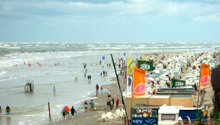
Beach at Baltrum-note waves breaking out to sea from Wikepedia entry
on Baltrum here

On looking  up the island on Wikipedia I found a photo which immediately suggested one of Klee's Baltrum works. It is a characteristic of this landscape to see waves breaking  at a substantial distance from the shore. Look at the row upon row of breakers in Klee's painting and compare it with the photograph above.

North Sea Picture

In North Sea Picture (1923:242) we see again the breaking waves far out from shore. Emphasis on the sky/horizon/sea divide, by now an old trope in modernist art, is found in North Sea Island-looking towards Langeook (1923:180

One or two of the works are more realistic-such as one of the dune views and a  view perhaps from the guest-house where  he  stayed. He made two works which refer in their title to the fact that the dunes were being stabilized-by planting grass or whatever method was in use at that time. These have a more realistic aspect . I have no doubt that Klee would be interested in the contents of rock pools and the structure of seaweed.
Stabilized Dune on Baltrum 1923, 262.
Incidentally Jurg Spiller in The Thinking Eye says that Klee started collecting this sort of material on visits to the Baltic. But I cannot find any evidence that Klee visited the Baltic shoreline.This visit to Baltrum would be a possible starting point for such collecting. A serious chronology of Klee's life is surely needed and I have used the outline provided by Sabine Rewald.

But frequently in  the Baltrum work one could say that Klee responded to the landscape in a more abstract sense. Sky and horizon and the parallel waves of the sea. One notices watercolours in a style closely relating to the Tunisian watercolours made just over 10 years earlier. It's a question of piled up squares of colour plus details such as a house.This is a style which he also develops  in later works relating to his Sicilian holiday. In the Baltrum works there is almost no trace of the Klee whimsy so common in other work from this period-particularly the so-called oil-transfer drawings.


In North Sea Picture  we see again the breaking waves far out from shore. Emphasis on the sky/horizon/sea divide, by now an old trope in modernist art, is found in North Sea Island-looking towards Langeook (1923:180)


Klee took a few holidays especially in the Twenties-which, probably not coincidentally was the period when he was a salaried teacher at the Bauhaus. Many of Klee's later holidays involved trips to coastal or island areas-Brittany, Elba and Porquerolles, Corsica also come to mind. He was often to stay in coastal areas and sometimes in hotter places such as Sicily and Egypt.

View from a Window- North Sea Island 1923, 259
Klee's visit to Baltrum occurred in the late summer of 1923. You will remember that 1923 was the year of the great collapse of the German currency and a period of incredible hyperinflation. This process had already become obvious when Klee left for the island. It was to escalate vastly in November of 1923. Despite any effect this might have had on the family finances I feel that no influence can be detected on his art. But it must have seemed a slightly surreal state to be in nevertheless. On his way home he called on Schwitters and El Lissitzky.

Erskine Childers: The Riddle of the Sands, Atlantic Books, 2009.
Paul Klee: Catalogue Raisonné, Vol 4, Paul Klee Founation, 2001.
Sabine Rewald:Paul Klee: The Berggruen Collection in the Metropolitan Museum of Art, 1988.

Tuesday 22 October 2013

LORDENSHAWS AS SEEN

I thought it might be curious to show different depictions of a scene I know well. It is the entrance to the hill fort at Lordenshaws, just south of Rothbury in Northumberland.The views are all taken from slightly different angles.  Diferent times, different methods.
From Upper Coquetdale by DD Dixon-who also made the drawing circa 1900

Recent photograph by myself

Watercolour by myself-painted circa 1995 on the spot. 


Monday 7 October 2013

Elsdon Gravestones: Abraham and Isaac

Elsdon: Abraham & Isaac gravestone on left, south transept,nearest nave
In the  Northumbrian village of Elsdon there is a very interesting church and churchyard.It has some of the most curious and primitive gravestones in the county. They tend to be from the Eighteenth Century but you would hardly know it. In style there is something of the innocence of an embroidery of a hundred years before. The Douanier Roussseau might have liked them.
Elsdon Churchyard: Time with Scythe


Elsdon Churchyard:Adam and Eve


I am showing two of them which might be the work of the same craftsman. There is also another carving-even more primitive which I did not know about until last summer when my partner spotted that the back of one of the stones-very close to the church had something carved on it. The carving is difficult to see and photograph but it obviously represents the story of Abraham and Isaac. Because it is so close to the wall of the south transept you cannot easily get behind it to frame a photo. This is one time when I would have liked to have a compact with me. As it is I show a sketch based on some partial images.


Elsdon Churchyard: Abraham and Isaac


This is  a primitive piece of work and the  figures are  presented frontally and parallel to the picture plane in one of the most ancient conventions for story telling in low relief.

On the left is the ram caught in the thicket.. Note the prominent horns. In the original you can see the naive drilling to represent the space between the curling horns. On the right is the kneeling figure of Isaac almost at the point of being sacrificed. In the middle is the patriarch Abraham with sword raised aloft.

Immediately above the Old Testament scene is a conventional cherub's head. Not shown. The carver had his pattern book or schemata to work from in that case and the work was efficient. Not so with the Old Testament scene. Perhaps it was his only effort with this subject and from an academic viewpoint the struggle is apparent.The carver was thrown back on his own invention and produced a clear if crude account of the story.
Elsdon: Abraham & Isaac
Colour photos added Feb 9, 2014

Saturday 10 August 2013

That's Gneiss-Glenfinlas Again

Ruskin in Glenfinlas. This is Millais' portrait of the author.


The Glenfinlas burn, photo by JH . 2013.


I was in Glenfinlas last week, never for long enough, I'm sure.But this time I did get down to view the site of Ruskin's portrait by Millais. I climbed down twice. Once the hard way and then the somewhat easier .The hard way is not to be recommended, for one thing there are bilberries(?) growing on the bank and for another the easy way is just a bit more practical with a DSLR and tripod. Do it the easier way and you get the view which Millais saw.(Hint,turn to the left under a beech as you approach the new viewing platform.)

You can see the rock on which JR stood in the foreground of my photo and the curve of the darker rock which is also visible in the painting behind it.The whole scene was of considerable importance for Ruskin whose geological interests still seem to await attention from someone in that discipline.He said himself that he often stood in such a pose meditating on nature.One notion of Ruskin's which Lutyens quotes is his idea that Glenfinlas would be a good site for Millais to work in because he habitually painted brightly-which this shaded spot would scarcely permit.

There were very considerable practical difficulties in making the painting, certainly in so far as the work that was done in Glenfinlas.There are reports of Acland holding the canvas  at one point while Millais worked on it. There is  Millais' own account of his lonely autumnal sojourn when he had to return and had a kind of makeshift shelter constructed complete with woodburning stove.It wasn't very efficient, he said, but the smell of the woodsmoke was pleasant. It scarcely seems possible that Millais could have worked in such a cramped and uncomfortable area.But toil he did and it is to the credit of Alastair Grieve that the site was rediscovered in the 1960s.

The best acount of the circumstances surrounding the commission is still: Millais and the Ruskins-by Mary Lutyens.

For another post on the portrait look here


Wednesday 17 July 2013

ART THEFT

Meijer de Haan-self portrait 1889/90.
The BBC has a news item suggesting that ashes from a stove are being examined to see if traces of stolen paintings can be found therein. This relates to the theft of items on temporary show at the Rotterdam Kunsthal in 2012.It is thought that one of the thieves or an accomplice may have destroyed the paintings. This raises some questions.

How can you tell? Even with modern forensic methods it sounds difficult.Can you analyse ash and conclude that it comes from a 100-120 year old work by Monet, Gauguin or de Haan or a more modern painting by Freud? And if the ashes are all mixed together? I wish them luck. Find some fragments of canvas or stretcher and it will be easier. Shouldn't we also be a bit sceptical? Thieves don't usually destroy assets.it may be just a blind.

There are also questions about the value of art.In this case I personally would be most sorry to lose the de Haan-though in an auction room the somewhat poor Monet or the not particularly special Picasso might do much better.

So why de Haan? His oeuvre is small and he died in his 4Os.This stolen portrait is one of his strongest, most avant-garde works. It is a fine painting in it's own right. And it has an important place in the Pont-Aven school. It has a distinguished provenance and was one of the half dozen or so colour plates in the catalogue for Pickvance's unrepeatable show on Pont-Aven in 1966. So take it away and we have lost  a key work . It would be hard to make that case for the Monet, Picasso or Gauguin which of course you wouldn't want to lose either.Here is the link to the BBC story.

Monday 15 July 2013

DIARY OF A LANDSCAPE PAINTER 2


Country Lane-oil on canvas
  Here is a small landscape painted from a tiny note on a scrap of paper.


What struck me about this scene was the composition, and that is what I recorded. It represents a scene in Spring, not Summer.

If you are concerned about the problem of green in a landscape then it is something you will have to think about in Summer, at least in the UK. But even in Summer not everything is a heavy, dull green. It is true that the delicacy has gone.But grasses appear in many different colours by the roadside or at the edge of fields. They can be pink, or greyish green, or just a faded,bleached, sandy colour. Also, be sure to try to look at the colour you do see with an unbiased eye. I was out in the country  the other day and the undersides of some sycamore leaves had a slightly blue cast to to them.Exaggerate this if you wish. Remember also that, first of all, you are making a painting. Countless artists have said this before me but it remains true.The picture has it's own laws and  necessities.

Saturday 29 June 2013

RODIN OR NOT?

 Drawing A

This drawing was sold on the internet recently for $2,100.00. A price of just over two thousand dollars would be ridiculous for a Rodin drawing of a Cambodian dancer,if one ever came to market.  If it is a Rodin the new owner got a bargain. If not they may have acquired a curiosity-one of the many,many forgeries of  Rodin in circulation.Here are some questions which the buyer could have asked before purchase.

Why is this drawing not in the Musée Rodin? You may say that not all drawings by Rodin are in the Musée Rodin.This is quite true, but most of them are and that is the way Rodin wanted it. Did Rodin not give drawings to friends and patrons you may object? Quite true, he did, and they often have inscriptions commemorating the event. He did not give drawings away to every Tom, Dick and Harriet. If Rodin gave you a drawing, be sure he thought about it and weighed the recipient's status accordingly.Adding an inscription to a forged item would be a risky business because Rodin's life is very well documented and his friends and patrons are well known. This would require thorough background knowledge of the Rodin circle so a forger would not wish for added complications such as this. Is there an inscription-other than a signature on this drawing? Not that I can tell.

 We would expect it to be in Paris because Rodin viewed his drawings as a resource to be tended lovingly. His experience with the Cambodian dancers was such that it is almost impossible to think that he would let a drawing from this group escape. It would have been too great a sacrifice.
But here again there can be exceptions.There are at least four cambodians not in the Musee Rodin-but all seem to have good pedigrees.

Why, if it is by Rodin, is this drawing exceptional in format among the Cambodian dancers? It is much larger than the dancers illustrated in the survey of drawings  mentioned at the end of this post  and it is considerably larger than the great majority of Rodin's drawings in general.This would give me cause for concern.The size is given as 17X 23 inches. Varnedoe mentions drawings by Durig in Rodin's manner on paper of approximately this size.Some are of Cambodian dancers.

As to the quality of the work itself I would say that it is poor. Rodin often makes the arms of his dancers long and snake like-to convey the expressive quality of their movement.But here they are somewhat wooden and lumpish. The neck is too long.There is no impression that there is a lower body under the skirt. The lower legs appear like those of china dolls where the torso is just cloth and stuffing. In general the drawing is too timid and careful thus failing to mimic Rodin's creative fervour.In one way this drawing is too careful. Rodin's drawings are spontaneous and quick. They are often messy and clumsy-but in an extremely spontaneous way. This one is messy,clumsy and deliberate.Rodin made drawings for his own ends. This one is different.

Is the drawing accepted as genuine by the  MusĂ©e Rodin?  

It is normal for  auction houses to advise that a work by, Klee, Nolde or Rodin for example is accepted as genuine by major experts on the artists in question. This happened on April 11 this year when Christies sold an important group of Rodin drawings in  Paris. Here it was advised that the drawings were  accepted as genuine by the MusĂ©e Rodin's experts.It could also be shown that the works can be traced through collections back to Rodin's day. As a result the drawings made good prices-way above estimates.

Here is another work,of similar size and quality- possibly by the same hand as drawing A. Perhaps also,intrinsically of better quality.

Drawing B

You can see many illustrations of works by imitators of Rodin's drawings at the Fogg website here.

If you want to read more about forgeries of Rodin drawings then please consult the essay by Kirk Varnedoe in Albert Elsen & J Kirk T Varnedoe: The Drawings of Rodin, London,1972. But bear in mind that this should be read in conjunction with Varnedoe's text in  the exhibition catalogue Rodin Rediscovered of 1981 where Varnedoe  revises some opinions. 

For a good selection of Rodin drawings-from the MusĂ©e Rodin, then consult; August Rodin: Drawings and Watercolours; by Antoinette Lenormand-Romain and Christina Bulley-Uribe, London 2006.You may also be interested in my  posts on forgery of Gauguin and Samuel Palmer.

UPDATE JULY 2013. Regarding expertise and authentication. This can lead to very complex situations-see for rxample this article about Andy Warhol authentication here.

Friday 28 June 2013

HIS MASTERPIECE-ZOLA AND CEZANNE IN PARIS

I have been rereading the old translation of Zola's 1886 novel L'Oeuvre. In English it is known as The Masterpiece or His Masterpiece. It is not a good book-by Zola's own standards - it follows Germinal and does not live up to that spectacular drama. It gives a picture of the Paris art world which is tolerable but hardly subtle. This is the work which is thought to have hastened or completed the estrangement between Zola and his childhood friend  CĂ©zanne. There is no clear cut evidence that this is the case. But CĂ©zanne himself and his Aixois friends from childhood would have had no difficulty in recognising the account of their adolescence. Zola had been  happy to use CĂ©zanne père as material   so why not his oldest and supposedly dearest friend?   This is the sort of cannibalism  into which authors are prone to fall when they are short of material. CĂ©zanne had also painted at Bennecourt which features in the early part of the book, in the company of Zola and Valabrègue.To be fair to Zola he does try to blur the issue-a little. One of Claude's paintings appears to derive from Manet's Dejeuner sur L'Herbe . Manet had just died and he at least was in no position to complain.

At one point  Zola describes Claude as painting a major project from a viewpoint on the right bank of the Seine under the  Pont des Sts Pères (nowadays the Pont du Carrousel) . This is the work which brings him to disaster. It  must be said that the imagined painting does not sound like any known work by CĂ©zanne. It is a slightly symbolist view-towards the  Pont des Arts and the CitĂ©. It will include-and this gives rise to serious difficulties- a nude female in a boat. She is apparently symbolic of something though this is not made clear. The writer Sandoz (Zola) finds this odd, to say the least.So we must imagine this scene containing a skiff with a naked woman at the prow. Claude cannot leave the figure alone and his creative torment leads eventually to his destruction.

CĂ©zanne/Lantier is described as  working from the quayside oblivious of the traffic on the bridge above, in what seems to be an isolated location . In the foreground of the imaginary scene is the Port St Nicholas where sacks of plaster are being unloaded by the crane known as La Sophia.The Port St Nicholas was just adjacent to the Louvre (and sometimes known as the Port du Louvre) and Zola describes a crane and the bags of plaster being unloaded.The postcard below is entitled Port des Saints Pères but is evidently the same area,just upstream of the bridge..


This is a  photograph courtesy of CPA-Bastille91.com which dates from circa 1900 and shows the busy quayside. Perhaps this image best illustrates something of Zola's imaginary composition. You can  see the Pont des Arts-the first bridge quite clearly.On the right of the image the dome of the Institut de France is prominent. In the distance you can see the flèche of the Sainte-Chapelle and then the towers of Notre Dame.
 

This is the pont des Saints Pères in a drawing from the early 1880s by Ottin.Below it the Port St Nicholas/Port du Louvre.The view is looking upstream. You can see a steam crane unloading sand.Quayside scenes are quite common in the work of avant-garde painters of the time. Monet and Guillaumin come immediately to mind. Cranes-les grues-also appear in images by Signac and Dubois-Pillet.

Tuesday 25 June 2013

THE WRECK OF THE TADORNE


Northumberland can be proud of its lifeboats and their crews.The county was early to be involved in the idea of a lifeboat service. So it gave me great pleasure to read the recently published booklet about the rescue of the crew of the the Tadorne at Howick in 1913. It covers the story of the wreck and the subsequent rescue of most of the sailors  by the crew of the Boulmer lifeboat.Unfortunately five of the ship's crew did not survive.There is also an account of recent commemorations associated with the centenary of the shipwreck. It is another witness to the bravery and dedication of the folk who crew the lifeboats. In this booklet we can see photos of many  members of the lifeboat crew. In those days and for a long time after the names of the Stephenson and Stanton families were closely associated with the Boulmer lifeboat. The booklet reproduces a painting by Arthur Marsh which reminds us that the women of fishing villages also played their part in rescues-here they are shown pulling the lifeboat into the waves.

The steam trawler Tadorne (Shellduck) had been on her way to Iceland for the fishing.She had a crew of 30, presumably to  allow for shift work.She went aground on the night of 29 March 1913 and her boiler is still visible on the coast near the site of the old boathouse at Howick Haven.The sailors who died are all buried at Howick, just as you enter the churchyard.
Part of the Tadorne's Boiler


 Perhaps Ms Meakin could have given more background about Howick itself. In the parish registers there is plenty of information available about the anonymous corpses of sailors found "cast ashore" at Howick in the early nineteenth century.Their clothes are described or there may be a note to say that the corpse probably came from a particular shipwreck.This would have been helpful if there were subsequent enquiries about the victims. In those days the sailors were often buried within 24 hours of discovery. In the parish records you will also find the name of the Catholic priest who conducted the funeral service.The register states, "Buried by  Alfred Verity Young, Roman Catholic Priest, Alnwick."The burials are listed under numbers  466 to 470.

 One press account has Earl Grey sending his driver to Boulmer with news of the wreck.This is not discussed in the publication-either to refute or confirm the story. The Craster coastguard  had certainly spotted the wreck. Did they not have any method of contacting/signalling to Boulmer?

Ms Meakin states that the Craster coastguard tried to get a line to the boat to use breeches buoy to rescue the survivors. The Evening Mail of 31/03/13 says that says that four attempts were made to get a line over the boat were made. Three failed but one did succeed.The paper states that the men were: "apparently so be-numbed as to be unable to make the line fast". The Mail also states that there was a gale blowing from the south-east and a heavy swell. 

For further background I would add that the Berwick lifeboat was also out that weekend in thick fog and rescued the whole 11  crew of the Swedish barque Jacob Rouers carrying timber to Grangemouth. Newspaper accounts paint the picture of a Northumberland coastline strewn with debris such as pit props from Scandinavia .We should remember that in those days the amount of shipping lost through running aground was considerable.

All that remains of the ship is half of its boiler which is very visible from Howick Haven and other parts of the coastline. If you want to visit it you must go at the lowest possible tide.Either the half boiler has moved in the past few decades or there was another half nearer the shore. Part of the boiler appears in  an illustration on page 68 of Ian Smith's Northumbrian Coastline (1988) and it is definitely horizontal and further inshore than the present fragment.But in 1993 Alec Thompson-whose family cared for the sailors' graves was photographed with a part of the boiler which is upright.As the remaining fragment is now. I tend to think that there were two halves of the boiler and that the part inshore was removed. But I could easily be wrong.

 Themes new to me are the involvement of Countess Grey's French maid who acted as interpreter at the inquest (on the Monday following the wreck-they did things differently in those days). And I would  have appreciated more information about the letter Countess Grey is described as writing to the Archenoux family after the remarkable recovery of Pierre Archenoux's sea chest.

This is a pleasantly presented publication  in the A5 format. But one page does seem to be superfluous.It is a wholly impressionistic  and general sketch of the mood associated with a shipwreck-not this shipwreck or rescue. It is Mademoiselle not Madamoiselle and there is some inconsistency in spelling the name Stephenson. Just the sort of typos you find after going to press.

You can buy the booklet at various tourist information centres in the locality. Its price is £3.00.

THE WRECK OF THE TADORNE-Avril Meakin, published Howick Heritage Group, 2013

(Updated November 7, 2014.)
(Updated October 30, 2015 with reference to the Evening Mail newspaper account.)

And see also my post of the cutting with ref to Alec Thompson of the Howick Seahouses family which first sheltered the seamen and then tended the grave of the dead sailors for years afterwards.  Also my painting of the site is here

Sunday 9 June 2013

DIARY OF A LANDSCAPE PAINTER 1

I was out painting near Alnwick on Friday.Two pochades were the result. And I found a view which may make another painting someday.


The sky on Friday was not very interesting-hardly anything in the way of clouds to be seen. I decided to paint a sketch which had little or no sky and would be almost all green.It gave me the chance-or challenge to make a painting out of nothing as you might say.In this sketch  there was no drawing and not much of a design.I always find this difficult and tend to want  more dramatic compositions.In this sketch I started with the pink of the track but used no construction lines. It was more a question of building up as opposed to filling in.

I thought it was really amusing that here I was, an artist of 2013 trying to put into practice something of the advice that Pissarro gave to Louis Le Bail in the early 1890s.

Do not define the outlines too closely; it is the brushwork of the right value and colour which produces the drawing. Paint the essential character of things; try to convey it by any means whatever, without concern for technique. When painting, make a choice of subject, see what is lying at the right and left, then work on everything simultaneously. Don't work bit by bit, but paint everything at once by placing tones everywhere, with brushstrokes of the right colour and value, while noticing what is alongside. Use small strokes and try to put down your perceptions immediately. The eye should not be fixed on one point, but should take in everything, whilst noting the reflections the colors produce on their surroundings. 

 I found it  liberating to work in this way on a pochade and the art historian in me began looking back to Pissarro's involvement with Neo-Impressionism and to the  work of Signac,the Fauves and so on.One thinks also of CĂ©zanne who surely benefitted considerably from his friendship with the "humble and colossall Pissarro".

The palette for this painting I used particularly the following colours:
viridian hue, chrome oxide green, cerulean blue, cobalt blue, permanent rose,  winsor lemon,yellow ochre,burnt sienna,flake white hue.


When I had finished work in the lane I set off to find another motif. When I last saw this view near Alnwick there was no sign of leaves on the trees.


Friday 31 May 2013

MARKET SCENE -OIL SKETCH


This is a sketch in oil on prepared paper. In a sense it is entirely imaginary. Influences are French more than anything else.I am thinking of Daumier and Bonnard.I am not trying to depict a particular place or people.Here below is an associated drawing from a sketchbook.

Monday 20 May 2013

RUSKIN GOES TO THE ASHMOLEAN

J Ruskin by J Millais-begun July 1853
completed Autumn 1854.

Millais' portrait of Ruskin is  a major work in the history of Pre-Raphaelitism and British culture and it is a matter for rejoicing that it has been accepted in lieu of death duties and will be part of the permanent collection at the Ashmolean. Because of Ruskin's long association with Oxford there  can be no more appropriate home for the portrait.It is a more substantial work than the somewhat undernourished Manet which the museum has recently acquired.

It seemed to me when I saw it last- a few weeks ago- to be a rather sad painting.The complicated  and often difficult circumstances of the commission may have something to do with this. One thing struck me:the proportions of the figure are not really satifactory and the head sits uneasily on the shoulders of a figure which is  not quite at ease.It portrays a very thin person. The proportions of head to figure are extreme but no where near so extraordinary as you get with Sargent.Where is Ruskin's waist? Is the mouth a little too "set"? That may or not be connected with Ruskin's childhood accident. Curiously enough John Dixon Hunt says that the figure had not been begun when the subject left Glenfinlas,"...although the background was almost complete,there was no  figure at all in the landscape...." But surely it would have been roughed in to some degree? If you are painting inch by inch, as Ruskin described there must have been some sketching in.An efficient painter does not look to waste effort by having to overlay areas already realised.

Again,the strained circumstances-the work being completed from life after Effie had left Ruskin and returned to her family in  Perth- are surely relevant.The personal relationship between Ruskin and Millais too was entering its  final stages.Any hope that Ruskin may have had of Millais becoming a great landscapist-in JR's view of things- was not to be.

I do not recall that Ruskin ever gave his own criticism of the portrait. It remained with his parents until they died.He gave it afterwards to his old friend Henry Acland. (revised Aug2013)

For another post on the portrait see here

The Wider Sea: John Dixon Hunt,London 1982.page 227.

Thursday 9 May 2013

HERTERTON BOOK

OUT NOW!!! see this link for info


A book is in production about the wonderful garden at Herterton in Northumberland.That garden is a small jewel in the world of gardening. It is simply the finest recent garden in the North of England.The garden is the work of Frank and Marjorie Lawley and now-at last- there is to be a book about it.

Here are some of my own photos.


Topiary at Herterton-Mr Lawley at work


More topiary

For further information about the book please consult the leaflet reproduced below.


The contact details are: valcorbettphotography(dot)com
and: joy(at)joymaynard.myzen.co.uk

WATERCOLOUR SKIES AND CLOUDS-THINK NEGATIVE!


Watercolour study on rough surfaced watercolour paper 
I have said before that I'm not keen on books which claim to tell artists how to paint this and that-usually quickly and in an easily learned way. But here I am writing a post about the painting of skies and clouds.It will be something of a summing up of what I have learned and am learning.In the examples I give I will show what I think are the faults as well as the good points in my example. None of your unrelenting optimism here! Art isn't easy.If this is helpful please let me know.You can see my post about the history of cloud painting here.And I will soon be posting further thoughts on the subject of how to observe clouds.
If you would like to see more of my landscapes including cloud paintings done from observation then go to my website.

The illustrations  which follow are of an improvised sketch-not done from direct observation or from a photograph.  If it shows understanding of clouds I'll be happy.Think of the subject as a moorland scene with clouds.The viewpoint is  looking to the west so the  light source comes comes from the left of the picture.I have not developed the landscape to any degree.

On rough watercolour paper measuring only 24cm along its longest side.That's about  8 inches.

Colours for the sky are Cerulean hue and Cobalt hue; for the shadows,Burnt Sienna and Dioxazine Violet.A neutral grey would also have been a fair choice for the shadows-and in a way more realistic. All from the Winsor and Newton Cotman range.
Brushes were a watercolour brush and a 2" decorator's brush.

Paper was an old scrap of English watercolour paper with a rough surface.Watercolour paper is expensive but can take a lot of working and reworking if necessary.Thin paper such as you find in most sketchbooks will not stand up to the processes mentioned here.

 Stage 1

Clouds and landscape dabbled in very quickly with a loosley held brush.The rough texture of the paper allows the broken textured effect appropriate to the kind of cloud I'm trying to paint.Note the puddled effect top centre which dried with a hard edge.This is  an error but at this stage it doesn't matter.In this example I have an attitude of finding out and working towards a goal rather than copying something visualised in my mind.The cloud shapes emerge BECAUSE I WAS THINKING OF THEM AS NEGATIVE SHAPES.I painted the blue of what we think of as background to define the basic  cloud areas. I painted the warmer, shadow side as a definite area.There is no pencil work although a little would have been acceptable.

Stage 2


The clouds are beginning to appear and have the light and airy look of a summer day in the UK.I have blurred the edges of the puddle top centre with a wet brush.In some ways I could have left it as it is. You can see the cerulean in the lower part of the sky and the cobalt above.The shadows on the clouds are painted with a mixture of violet and burnt sienna.

Stage 3


The intensity of the sky is emphasised and the cerulean lower down is strengthened. The shadow colour of the cloud is also deepened. some of the colour where the shadow sides meets the blue of the sky was removed with an old linen tea-towel.Again one might regard this as a possible final stage.

 Stage 4


I think that I may have pushed the colour and definition too far here.Perhaps this needs more work! The photo exaggerates a little. You can see the harder edge of the cloud catching the sun and the similarity in values between the right edge of the clouds and the sky behind.You will often see this in skyscapes.You can also see the change in values between the lower and higher sky.

Stage 5


I did think that the blue of the sky in stage 4 was too intense so I proceeded to stage 5.All that happened in stage 5 is that I held the sketch under some warm running water for a couple of minutes and then stroked it gently with a big  decorator's brush. Because the paint was loosened it was removed  most noticeably from the upper sky and from the landscape below.You should be able to see the white speckled effect in both areas.

Stage 6

I
You may be glad to know that this is likely to be the final stage! There was very little work done here.For the sky I ran some cobalt hue over the upper area to lessen the effect of the white speckles from stage 5.I would say that the speckles give some effect of airiness and atmosphere to the sketch. Where the cobalt meets the cerulean I blended it in with a little clean water on the brush.I also subdued the whiteness of the long patch of cloud at lower left-it was too white.I also diminished the speckled area in the landscape with a very slight wash.

In Conclusion
Paint freely-defining the background to help you get the cloud shapes.

Do not worry about definition too early in the day.

Be prepared to experiment with blending colour-either with a wet brush or by smudging it with a rag.

You need really clean water to preserve the quality of the sky colours. Two jars of water would be fine. Use the first to clean the brush and the second for the actual painting. Be consistent.

Use good paper.

Friday 8 March 2013

Venice Haiku


I came across this book the other day. It is full of charm and wry observation, not just of the eternal truths of Venice but human nature also.Nicely produced in small format, on pleasant paper it provides some shrewd and well observed snapshots of Venice.Iron Press have produced a small gem.

This haiku describes an aspect of Venice which normally would not figure in the tourist image of the city.

Boasting a uniqueness of watery streets,
Hidden behind the railway terminus
Clumps of shame-faced automobiles.

Venice Haiku,by Mike Wilkin,Iron Press,2011.

Saturday 16 February 2013

Richard Hobson Monotypes

"Carrion for a Tyne Swansong"-Richard Hobson
1994

Yesterday I visited the exhibition of Richard Hobson's work in Gateshead. I had put off going until an old friend came down to visit it with me.Many of the works on show gave me great pleasure, especially the monotypes.My illustration shows one of Richard's typical subjects. It isn't in the show, which is a pity.But there are other fine examples to be enjoyed and some of the best involve birds and/or shipyards.I can recall a conversation I had with the artist in which I remember asking him about his procedure.He confirmed that he used oils and that the paper was then kept warm so that it would dry out quickly.I suspect that he may well have removed some of the oil  beforehand.

If you don't know what a monotype is then here is my very brief explanation.In Hobson's case a large,smooth plate was used as the base for the design.It might have been glass or perspex or even metal, but it would certainly need to be inflexible and solid.The design was painted out in fairly fluid brushstrokes and then an impression taken. Most of the monotypes are quite elaborate and would have surely required more than one printing. To permit this the paper needs to be held in place by some form of clamp.The paper used for the large monotypes appears to be heavy and perhaps of Japanese manufacture-quite expensive stuff.To make the transfer of the image from plate to paper it is sometimes necessary to burnish the paper from the back. An ideal tool for this is the japanese baren but it is perfectly possible to improvise a pad of your own-or use a wooden spoon.Work on the scale that Richard undertook needed a lot of energy.

You  can see evidence of slightly runny oil wash in some of the works.Some of the forms also have a pleasant fuzziness. Also visible are the occasional marks where the end of a brush or some other implement has been drawn through the colour to produce a white line.

I have always liked Richard's monotypes.They have a broad,luminous quality which isn't present in some of the more thickly painted watercolours. In this exhibition they are the best of his work. Also shown in cases are some reference photos and sketches.Unfortunately there is no catalogue-just a price list which you cannot take away.I am not sure if the title of the exhibition quite fits the work-what is a "Northern Realist" anyway?

 The exhibition of Richard Hobson's work continues at the Shipley Art Gallery until March 2. I can heartily recommend it.You can read more about Richard and the circumstances of this show in Barbara Hodgson's article here.All the works illustrated are monotypes.I have recently added a note on one of Richard's best shipyard watercolours which was sold recently at Anderson and Garland.It can be found here.

Thursday 31 January 2013

Gillies observes

West Highland Gate-Willie Gillies

To Edinburgh on Wednesday to see the Turner watercolours.This is becoming something of a habit now. It is certainly a habit which Edinburghers have taken to.There are always 15 or 20 folk looking at the small but exceedingly choice group of works which are only displayed in January.

In fact I almost didn't go but the discovery that there was a chance-the last chance almost to see a show of Gillies watercolours clinched it. I had to go! It promised to be a treat in itself, and so it was. Most of the Gillies subjects were promised-the Highlands, the fishing villages of the East Neuk, farmyards and Temple itself.

I once  knew someone who had seen Gillies drawing and he told me that the artist was as liable to hold the drawing implement at any odd angle or with any grip other than as if writing.A pencil might be held near its base and pushed up the paper.That Gillies' line is fluent and free is obvious. His use of watercolour is very striking. I thought that quite a few of the works at the Scottish Gallery tended towards a fairly liquid gouache rather than watercolour.I wonder if he ever bothered with aquapasto. I'm thinking mostly of the freer more painterly works such as Rosebery near Temple.It seems to me that Gillies is at his best in the drawings and watercolours. I remember the big retrospective almost 20 years ago at the RSA as being rather disappointing when it came to the large oil paintings and  I certainly feel that he was easiest and most natural in the lighter medium.

It was  thoughtful of the Scottish Gallery to make the catalogue of the show available online as a PDF and you can download it here.The work I'm illustrating will have a resonance for anyone who has ever been in the west of Scotland.It is a small pencil sketch.I like it because it says something about the crofting, small farming way of life there.It reminds me of the accounts of crofting life in that poignant,matter of fact,unsentimental,witnessing found in Night Falls on Ardnamurchan by Alsadair Maclean. Maclean has something to say about the make do and mend lifestyle of his father who had to cobble together shelter for his beasts from whatever  materials could be found or collected. The gate is just the sort of thing you find where farmers have to bodge things together. There are an odd number of verticals and one of the cross pieces seems distinctly rickety.The whole thing seems fragile and possibly held together with a prayer and a bit of string. 

Tuesday 22 January 2013

Exhibition Pictures


Well, the pictures are in place at the People's Theatre.You can download a PDF (16mb) showing most of the landscapes and a price list here.The hanging went surprisingly quickly: this was particularly due to Robert's patient and efficient help.The dreadful weather over the previous several days did a lot to increase the stress.On Friday 18 January I had to go to Alnmouth to pick up two paintings from Mick the framer who runs the Old School Gallery with his wife Amanda.

Given the weather forecast I had decided to go by train rather than risk a  car or bus journey.The chances of the A1 getting blocked were considerable and I just didn't feel like more stress and danger. When I got to the station all the trains seemed to be on time-except the one I was due to take.But I had an anytime ticket and so could catch the next train-in less than an hour.On the journey to Alnmouth I noticed the countryside getting whiter. You can see Northumberlandia on the left as you head north-about 15 minutes from Newcastle.It's profile is quite evident. Its a nice idea to produce an earth work but really it is rather timid and basic. It doesn't look very big, either.

From Alnmouth Station it is a 20 minute walk to the village. So, there I was with my walking pole,my gardening boots and my trusty umbrella. The umbrella was a great help as the snow was coming sideways at me. Visibility, because of the brolly in front of me was almost zero but,hey, Alnmouth is in my genes and it is a straight road.

At the gallery they were most welcoming and Mick's work set off the paintings nicely. He is very quick at understanding what you are aiming for. A cup of tea from Amanda was really very welcome and then, I had not expected it-a lift back to the station with my parcel was a kindness I shall remember for quite a while.Well,almost to the station,we got onto the bank which proved slippery and I had to leave Mick and press on for my train.

At the station I noticed someone selling coffee. I cannot recall the name of the firm in question but this seemed a little desperate. There seemed to be a small, square shaped tent made of transparent plastic material. Maybe there was one of those little vans attached. But you had to think, how do they put up with it?What do they do about a lavatory? Presumably there is some deal with the station. It is a manned station now,again, but I couldn't see a lavatory for passengers.I suppose that this kind of stall is the modern version of those  canvas and wood coffee stalls you used to see in the past.When the train approached you could see its lights about 150-200 yards away-but hardly see the train itself.